Getting Your Kitchen Tile Colours and Cabinets to Work Together
Obviously, remodeling cabinets is a fun project, but once you reach the tile section of the store, you know that you will have hundreds of options that may work with your new cabinetry. It's one of the smaller decisions you need to make when tackling the tiling for your kitchen, but one that can make a huge impact for years to come. If you get it right, your kitchen will appear pulled together without doing too much work. The wrong combination can otherwise make even a gorgeous cabinet appear mismatched with the rest of the space below the wrong splashback or floor tile.
In2Science's work highlights the outcomes of having two good choices not work together, as described in this Client Story.
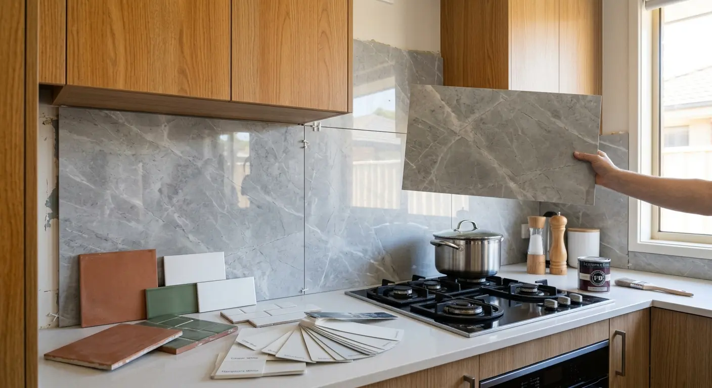
Michael is one of our clients who came to us halfway through the renovation with an unexpected problem. He had already decided on a warm oak cabinet scheme for his new kitchen and had separately fallen for a cool grey backsplash tile (marble finish) for his splashback area. In the individual columns, both were beautiful. They stood next to one another; instead of complementing, the warm wood colors battled with the cool grey hues, and the kitchen was disjointed, not designed.
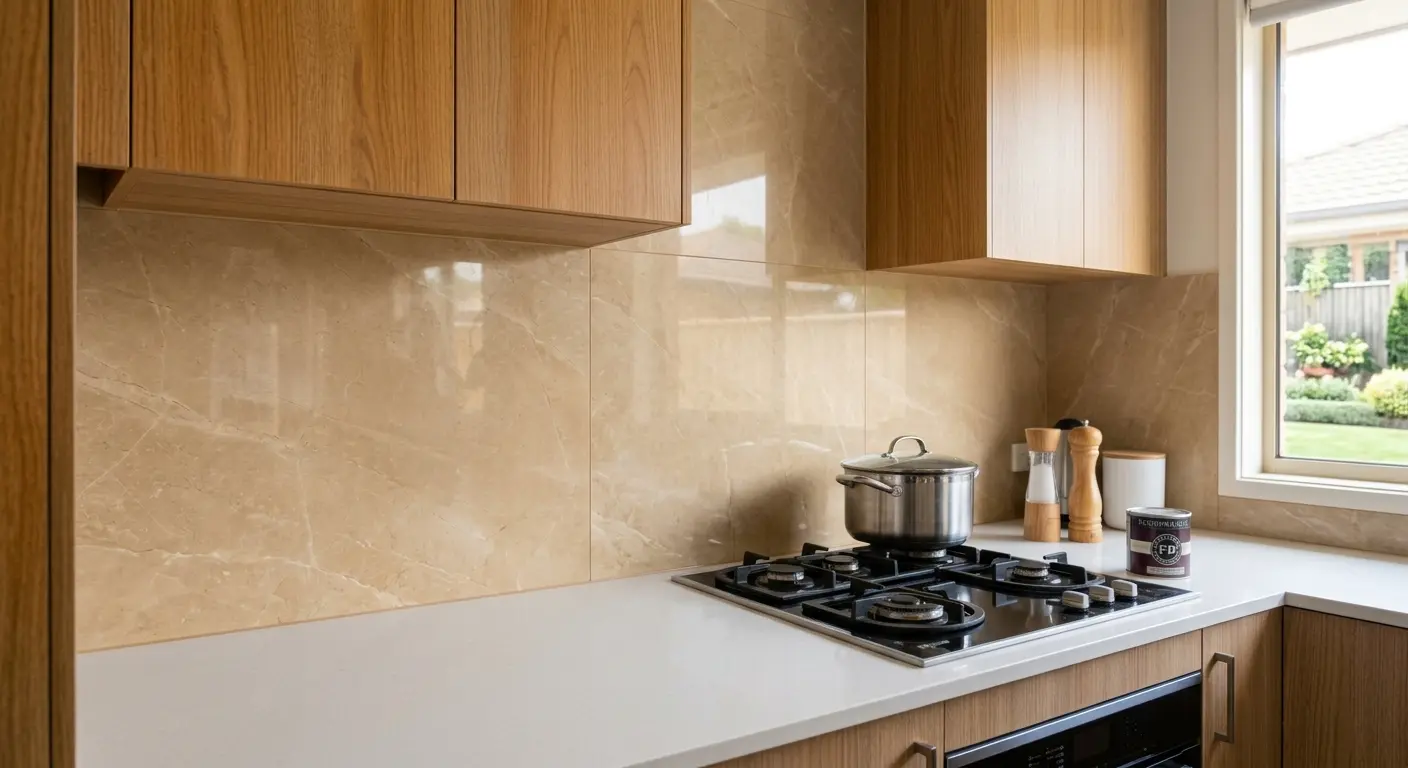
We met with Michael to discuss some of the kitchen's tile options that would work with his existing cabinetry rather than against it. In the end, though, he shifted to a honey-like stone-look tile, with some veining, but the entire kitchen was complete as he had envisioned. It does happen, and another case in which a bit of color theory in the beginning will make it much easier to rectify colors once the tiles are installed on the wall.
Why Color Matching is More Important than People Think
One of the few times cabinets, benchtops, tiles, and flooring are all in the same line of sight is in the kitchen. Even great materials can appear to be produced by accident when those elements fail to ignite a consistent undertone or contrast. However, a cohesive scheme of color will help to make a kitchen feel more subdued, larger, and more expensive than it was because it is viewed as one decision, not multiple.
This is typically where most of the clients in Melbourne begin to ask questions, between selecting cabinet doors and choosing their splashback measurement. Early selection of the color combination is a good way to avoid second-guessing and reordering later down the line.
Matching Tiles to Cabinets: The Basics
To get a sense of which combinations succeed, it's important to recognize what the two factors are: undertone & contrast.
Undertone is the first consideration; color second. A white tile can be either a warm (cream or ivory) or cool (blue grey or stark white). It is important to choose a cabinet color close to the tone of the tile rather than the exact color.
Contrast creates focus. If your tiles on the splashback are darker coloured, or lighter coloured, these will stand out and make your splashback a standout. Midway shades furnish a sweeter and softer appearance. If yours is cracked or dated rather than just the wrong shade, see the signs your kitchen splashback needs replacing.
Texture balances color. A patterned or textured tile often allows a bolder color hue to not overwhelm the room's space, while a busy cabinet finish will most likely accentuate an overcast or subdued tile. Tile size matters too, so see kitchen tiles Melbourne: subway vs large format.
Popular Kitchen Color Combinations We're Installing in Melbourne
There are some color pairings that repeatedly appear in kitchens, like it or leave it, because they really do work, and looking great obviously helps if it's a time you might be looking to sell the home later.
- Paint wood cabinets with a soft cream or beige color. One of the most demanded looks today, with a natural, warm look without being too rustic.
- Two-toned cabinetry and neutral splashback. It is a neutral tile that allows two colors to play harmoniously when it is used on cabinets that have already implemented two-color typologies, such as dark bottom and light top, for example.
- Cabinets are matte black or charcoal tiled and are contrasted with white or light grey tiles. High-contrast pairing that works well in contemporary, minimalist kitchens and where the tile details stand out.
- Subtle white cabinets in the kitchen with splashback colors that have a stone-look finish. It's simple enough to update at a later point with almost any type of benchtop or flooring and is a timeless piece.
Discovering the Most Typical Errors Made in Melbourne Kitchens
Many color matching errors have been observed, and it's probably quite common with good intentions. Probably one of the biggest ones is choosing a tile without seeing it in the actual kitchen with the actual illumination you have; colors may seem to be entirely different when viewed in the sample under a certain light as opposed to your kitchen's natural daylight. This is a simple thing to do: Order large samples of tile and test them on your cabinet doors in your own kitchen how they look at night, how they look in the kitchen, and at what time of day. So, take some large samples of tile and test them against actual cabinet doors in your own kitchen at different times of day, and prevent any coming back to feel very regretful later on. It's also important to remember that it always looks different when a small example is tiled over the entire length of a full-sized splashback, and therefore, it can always be helpful to view a larger mock-up as much as possible before committing to the final installation.
Immediately Involve Professionals Before Making the Commitment
Most homeowners opt to hire a professional team that specializes in kitchen tiling Melbourne before making the final call when it comes to choosing the materials, which is why this is the case. An expert second opinion can catch another set of people's eyes before it becomes a costly failure and can also introduce you to some tactics you might not have thought of to feature tile choices, and can help you avoid common tiling mistakes that show up long after installation.
Color consultation is a part of all kitchen renovations at Metro Kitchens and Tiles. We go into the customer's home and bring the actual samples with us to allow the customer to see and discuss how the look of the cabinets will come together with the actual finish, not just a photo. It was that talk that meant Michael could avoid a refurbishment of a splashback and do it right the first time.